The 35-Yard Line Kickoff: More Touchbacks, Longer Returns

For a project for @simplystats, I had to analyze a dataset.  I picked the NFL data (as NFL.com had data from 2000-2012 on their website).  I scraped the play-by-play data, and the time constraints for cleaning the data was relatively high.  I decided to scrape the box-score data, text example, more polished output, but even this had some problems.  Two interesting summary measures were: Kickoff Returns (Number-Yards) and Kickoffs (Number-In End Zone-Touchbacks).

Many of you know that in 2011, the NFL changed the kickoff line from 30-yard to 35-yard, but did not change where touchbacks started out at (still the 20).  As a result, we wanted to see how dramatic of a change of touchbacks/return yardage has happened in those 2 years.  We wanted to keep things very simple and on a grand-view level.

Image

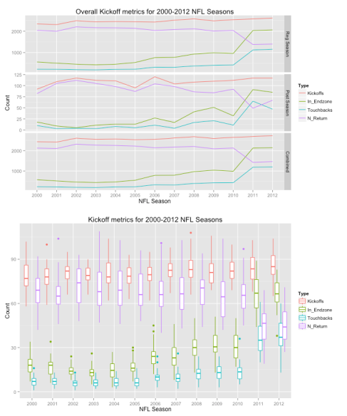
Overall – we looked at the total number of kickoffs, those that were in the endzone, number of touchbacks, and number of returns.  Overall, in the regular season and the post-season games, we see that the number of touchbacks has increased dramatically (and naturally the number of returns has decreased) since the change in 2011.

Also – the bottom panel shows the distribution of these metrics ( aggregated at a team level )  but has the overall boxplot to show that the variability are not changing drastically over the year.  We may have individual teams changing drastically, but again we’re looking more at a “league-level”.

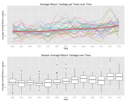
Now, using the average return yardage – by dividing Yards / Number returns for kickoffs, we looked at how this may have changed in years 2011-2012.

Image

The top plot shows the spaghetti plot for each team (Houston Texans start in 2002), and a loess (Cleveland) smoother (with 95% confidence interval) shows that there is a weak increase over the years for the average return yardage.  Looking at the distributions of each team (below panel), actually shows that seasons 2011-2012 have a slight jump compared to the other seasons.  There are a few ways to test this (wilcox rank sum – collapsing the years past, linear spline, etc, and each were “significant”), but we simply present the data.  Overall, there’s an estimated 1.75 yard increase (comparing to 2000-2010) or 1.53 yard increase (comparing to just 2010 average) in the 2011-2012 seasons.

So there are more touchbacks, but it seems that if one is returning a kickoff, they would return slightly more yards than in years past.  This could be for a slew of reasons: a better selection procedure, kicks returned are shorter, maybe harder to cut angles for defense (thanks T. Louis), or something else.  Whatever it is, I thought it was interesting.

Avg Return Yardage for Year 2000

21.05 21.51 21.96
Slope for Years 2000-2010 (avg yards /year)

0.07 0.13 0.19
Change in slope for years 2011-2012 (avg yards /year)

0.15 0.51 0.87

Acknowledgements: ggplot2 is awesome

Why aren’t Researchers using Google Refine?

So I was delighted to see a post from: http://www.propublica.org/nerds/item/doc-dollars-guides-collecting-the-data about how scraping data and they use Google refine: https://code.google.com/p/google-refine/

I have heard about Google Refine a while ago, but as I feel more comfortable scripting and having that as a roadmap to what I’ve done for an analysis/data cleaning, I choose to use that.  But I wonder, why do researchers, who are stuck in Excel many times, not use this as their main data cleaning tool?

The features are more powerful than Excel at times and can be re-exported from Google Refine, so that you can make plots/etc.  Also – it can be integrated with Google Docs.  And the data does not go to the cloud unless you’d want it to – all data is run on your machine.  In the heart of reproducibility, when you create an project and export it, it saves your “history”, essentially a long list of things you did (and can undo any of them at any time).  I’m not saying that this is “reproducible” in a lot of the sense that people are discussing nowadays, but it seems a much better solution than changing excel sheets with no history, or multiple sheets, or multiple (and usually poorly annotated) versions.

So why don’t they use it? A new tool to learn/fear? They don’t know about it?

Here again is a good description on how it is used: http://www.propublica.org/nerds/item/using-google-refine-for-data-cleaning

Why does NFL.com hate giving the San Francisco 49ers points? (and specifically Joe Nedney)

So I was looking at some older games on NFL.com and found something interesting about their box scores: they shave points off Example.  I tried to find some pattern (in 5 minutes) as to why this was happening.  There didn’t seem to be one that I could tell (some games were ones that only had field goals and were OK, others with touchdowns were OK and others were not).

I imagine it’s some missing link in the NFL database about a player or just the 49ers.  I sent them an email with the game ids so they could fix it.  Overall, though I was really surprised.  Isn’t sports stats supposed to be the pinnacle of clean data?  Don’t you have people pour over this stuff day in and day out to make lines/create schedules/reporting/etc?  I know NFL isn’t doing that directly (except for making schedules and reporting), but I was still surprised.

So no – NFL doesn’t hate SF or the 9ers (that I can tell), but I am even more firm in my adage of ‘what do you mean your data is “clean”‘?


Shiny App for looking at Models

How many times do you hear “That model looks good, but what happens if you add/take out this variable”?  I’ve heard it one too many times and I finally have tools to combat this problem.

Introducing my first “out there” Shiny App:

https://github.com/muschellij2/Shiny_model

The app allows you to toggle on/off a set of predictors, and select from a list of outcomes, and presents the GLM of that (hopefully with correct interpretation of estimates).  If you want more families, it shouldn’t be hard.  It also shows you the generalized added variable plot from `car` package, so you can look at your heart’s desire for non-linearity in your predictors.

Steps to use (in terminal)

git clone https://github.com/muschellij2/Shiny_model.git

(or just download server.R ui.R)

setwd(“DIRECTORY those files are in”)

require(shiny)

runApp()

That’s it!  I have loaded up some mock data set in there that mimicked what I was working on, so make sure you don’t think I added real data.  Let me know if you like it (I’m not adding more features at this time – just a work in progress).  If you want to learn more, check out http://www.rstudio.com/shiny/ and their great tutorials.