Interesting article of how to get FreeSurfer meshes into blender so you can do some cool stuff with them.
Monthly Archives: January 2013
#jhsph753 The data may not contain the answer. The combination of some data and an aching desire for an answer does not ensure that a reasonable answer can be extracted from a given body of data -John Tukey (via hopstat)
jhsph753 The data may not contain the answer. The combination of some
data and an aching desire for an answer does not ensure that a
reasonable answer can be extracted from a given body of data
John Tukey
Stata Markdown!
So I was just perusing the webs to think if anyone in the Stata world was trying to do Markdown after an LDA lecture.
Interestingly, I found this post, and it looks like people are working on it

Richard Hamming: You and Your Research
Link to You and Your Research live talk by Richard Hamming.
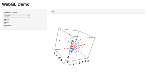
RGL and Shiny
So I love interactive graphics. I also enjoy 3D graphics, when they are necessary, and RGL suites me pretty well for them.
I recently forked a github repo (https://github.com/trestletech/shiny-sandbox), and just made a quick working example of how to make a 3D scatterplot with options of changing data sets, and taking certain types of points out (WM – white matter, GM – gray matter). Try it out here: https://github.com/muschellij2/shiny-sandbox.
Hopefully in the future I can get the camera angles and matrix rotation to stay fixed when adding/deleting points.
Edit: If you clone the repository (using git clone), load up R,
library(shiny), and setwd into the repo directory, and just run
runApp() in R, you should see This screen
Social Network Capability for Conference Apps
Over the past year I went to the Society for Neuroscience (SfN) conference. If you have never been, it’s a sight (here is a link to the attendance until 2009 – where they had over 30000 in attendance). Also, the poster session is enormous and a labyrinth if you don’t have a plan. One good thing was that they had an app to help organize your schedule.
My question is: why not have the ranking of those that put a poster/session on their schedule for new researchers to see the “hot topics”? Also, the ability to follow who is going to what poster/session may help you see friends/colleagues or follow someone whose views you respect on the topics?
Obviously it’s easier to ask why they’re not there than to help implement it, but I think these would be the future of conferences, especially large ones.
Nice Angry post about R’s quirks
My Fight with forestplot: Now forestplot2
So a collaborator of mine (let’s call him Joe) wanted side by side forestplots to compare the odds ratios for the treatment effect in our current study compared to a published study using data from a PDF.
After using readPDF from the tm package in R to get the data in, without having to type it in by hand (at an attempt to make this reproducible), I started in on the forestplot. I used the rmeta package after some googling and found it had a simple-enough syntax and flexible enough input so that I could use non-standard odds ratio estimators (may use some causal estimators) if needed.
I’ve found that with many of my collaborators, tweaking and customization is the rule, not the exception. This was no different. First off, Joe wanted some boxes to have different colors, and wanted the text big since it was going into a powerpoint slide. Hacking through this and other features, I added an option to pass a vector of box colors, line colors, font sizes, graph width, changing rectangles to circles, changing the column gap size, defining the range of the x-axis, and an “add” flag so that you can call this function without plot.new() getting invoked.
Here is the code (posted using Gist from this post:
Also, Joe wanted to have side-by-side forestplots. Using par(mfrow=c(1,2)) would be the solution here, but forestplot uses grid viewports that don’t support this. Thinking about how this may work best, I decided to use LaTeX, the onimage package (see stackexhange) to put a box around some odds ratios, and the preview package to simply get an image and not a whole document. I did some trimming and such:
Here is the LaTeX:
and the final image is here
Edit: Found this post https://stat.ethz.ch/pipermail/r-help/2010-April/235849.html that did something similar with respect to circles
